EVERYONE HEAD ON OVER TO THE BRAND NEW SITE AT www.ARTAGEM.com. That's where all the REAL FUN is happening.
-Max
Thursday, September 15, 2011
Tuesday, September 13, 2011
Chandra, Page 21: The Moon Is A Harsh Mistress
Begin Chandra / Go to Previous Page / Continue to Next Page
Yeah okay, I know, it's a Heinlein book. But come on, Commander Davis is a fan, so what do you expect? The Commander here is one of my very favorite characters. I feel that I was able to convey a lot about his personality in just the two pages that we've seen him so far. Probably much more than say Danya, Rocky or Tom.
You out there with the sharp eyes will note that the weights are 135 kilograms apiece, which is 297 pounds. BUT, on the moon that would only be 49.3 pounds each. Of course, there's still the mass to deal with...hmmmm. Little details and considerations, all things that need to be taken into account when making graphic novels.
Seriously, if you haven't read 'The Moon Is A Harsh Mistress' by Robert Heinlein, pick it up now! It's about a civil war between Earth and a Lunar colony, what else do you need to know?
 |
| Click to Enlarge |
You out there with the sharp eyes will note that the weights are 135 kilograms apiece, which is 297 pounds. BUT, on the moon that would only be 49.3 pounds each. Of course, there's still the mass to deal with...hmmmm. Little details and considerations, all things that need to be taken into account when making graphic novels.
Seriously, if you haven't read 'The Moon Is A Harsh Mistress' by Robert Heinlein, pick it up now! It's about a civil war between Earth and a Lunar colony, what else do you need to know?
Monday, September 12, 2011
Creator Highlight # 1: What Nonsense by Caitlin Crowley
Welcome friends to a somewhat weekly feature on Artagem: The Creator Highlight. I'll take a moment from time to time to point you to the home sites of creators I appreciate, whether they're other web comics, fine artists or just general troublemakers.

Taken from Crowley's site: What Nonsense is a humorous horror/suspense comic featuring anthropomorphic animal characters. The story follows the lives of the slightly deranged residents of "Nawncentz Inn," a remote vacation home, and the confused man who has been forced to live with them. I'd say there's nothing too adult about this story, save for some violence and cursing. It's recommended for ages 14 and up.
More after the break.
Sunday, September 11, 2011
Stray Flights #1: Desiccate, Page 8
Begin 'Desiccate' / Go to Previous Page / Go to Next Page
And we have arrived at the final page! Can you believe it? Now, a good editor would no doubt tell me that this page is unnecessary as well, but here it is nonetheless. I couldn't help myself, I wanted some kind of capping image for the little story, and the Pierre Loti quote just really served to bring home the message of madness inside Paul.
The crazy continues after the break.
 |
| Click to Enlarge |
The crazy continues after the break.
Saturday, September 10, 2011
Hey, It's Time To Talk About: Swamp Thing, Book 1
That which you absorb with your eyes and ears is just as important as that which is spun from the fingers. Therefore, take a moment to pause for a little review:
Saga Of The Swamp Thing, Book 1 by Alan Moore, Stephen Bissette and John Totleben
Much has been written about Alan Moore and I probably won't bring anything new to the table here but I did want to offer my perspective on this singular book (series). Like many, my first introduction to the work of Alan Moore was The Watchmen. He's of course a legend to many, a god to fanboys, and the mad devotee of Glycon, and his influence in the field is immeasurable. I could write whole posts just about Moore but this is a review of Swamp Thing.
'Moore' after the break.
Saga Of The Swamp Thing, Book 1 by Alan Moore, Stephen Bissette and John Totleben
Much has been written about Alan Moore and I probably won't bring anything new to the table here but I did want to offer my perspective on this singular book (series). Like many, my first introduction to the work of Alan Moore was The Watchmen. He's of course a legend to many, a god to fanboys, and the mad devotee of Glycon, and his influence in the field is immeasurable. I could write whole posts just about Moore but this is a review of Swamp Thing.
 |
| Swamp Thing, the loneliest hero |
'Moore' after the break.
Friday, September 9, 2011
Chandra, Page 20: I Know The Base Like The Back Of My Own Hand
Begin Chandra / Go to Previous Page / Continue to Next Page
Whoa, lotsa dialogue! And here he is, our fearless leader of Chandra, Commander Henry Davis, training away to keep himself fit, and fight the withering effects of the moon's light gravity. These first twenty pages were finished exactly one year ago today, crazy huh? It's strange looking back because I feel I've learned SO MUCH about making graphic novels since first drawing these. Despite the big blocks of text, I think this page is successful enough in most ways.
Let's break it down after the break.
 |
| Click to Enlarge |
Let's break it down after the break.
Tuesday, September 6, 2011
Chandra, Page 19: Oh. That Looks Deep.
Begin Chandra / Go to Previous Page / Continue to Next Page
What works? The first and second panels are fantastic. I think they really breathe and though I broke the 180 degree of action rule (great discussion here on Mark Kennedy's really awesome blog) by placing the camera on opposite sides from one panel to the next, it still totally works. There's also a really great swooping effect of the composition of panel two. They eye skitters from the vent and Jason's work, to the picture, over his back to the toolkit, and on to the doctor's words and posture.
 |
| Click to Enlarge |
Good morning ladies and gentlemen! A sunny day here, in contrast to mushy post-Irene last week, and with it, page 19. Jason and Dr. Bannister begin their investigation of the good doctor's quarters.
We'll break it down further after the break.
Sunday, September 4, 2011
Stray Flights #1: Desiccate, Page 7
Begin 'Desiccate' / Go to Previous Page / Go to Next Page
Shock! Gasp! And Reveal! Turns out things aren't as they seem for ol' Paul. Yes, this is shaping up to be stealth advertising for a filter product that doesn't exist. By the by, can you believe there's only one page of 'Desiccate' left? IN TWO WEEKS there will be a brand new Stray Flight debuting in this spot!
Continued after the break.
 |
| Click to Enlarge |
Continued after the break.
Saturday, September 3, 2011
Leftover # 1: Gambled And Lost

This is just a simple single sheet drawing I did today. I'm working on a slightly looser style, but finding it difficult to let go. For that reason this didn't come together exactly as I wanted but it was a lot of fun to color though!
As always, Leftovers are simply experiments and non-contextual works that don't belong anywhere else.
Friday, September 2, 2011
Chandra, Page 18: I Would Not Recommend It
Begin Chandra / Go to Previous Page / Continue to Next Page
Wow! Page 18 already, Chandra's officially an adult. This is one of the first pages I think actually works pretty well. It has a decent, cinematic feel to it that reflected what I was going for in my head, though the final panel ended up looking a little tacked on. But, I think the dialogue was a bit fun on this page at least.
Here is actually a pretty important point: That of final product matching initial idea. How does one make sure that they can follow through in creating the wonderful, amazing vision that is hovering in their mind? Some would argue that skill is the great deciding factor here. That those creators with more facility will always be able to chase their visions down and wrangle them more effectively into the real world. Skill must be honed by hours bent over the drawing table, or standing at the easel or whatever. But most importantly skill must be open to change and adaptation. How many of you out there have worked through a composition only to stumble into something better than you first imagined? Happy accidents huh?
Continued after the break.
 |
| Click to Enlarge |
Wow! Page 18 already, Chandra's officially an adult. This is one of the first pages I think actually works pretty well. It has a decent, cinematic feel to it that reflected what I was going for in my head, though the final panel ended up looking a little tacked on. But, I think the dialogue was a bit fun on this page at least.
Here is actually a pretty important point: That of final product matching initial idea. How does one make sure that they can follow through in creating the wonderful, amazing vision that is hovering in their mind? Some would argue that skill is the great deciding factor here. That those creators with more facility will always be able to chase their visions down and wrangle them more effectively into the real world. Skill must be honed by hours bent over the drawing table, or standing at the easel or whatever. But most importantly skill must be open to change and adaptation. How many of you out there have worked through a composition only to stumble into something better than you first imagined? Happy accidents huh?
Continued after the break.
Wednesday, August 31, 2011
1000 Things To Learn, #3: Uploading Images To The Internet Without Losing Color Fidelity
Warning! Bunch of technical stuff follows. May not be for everyone. Skip down to the last post to get to a Chandra page.
As I broke it down in THIS POST, I'd been uploading images to this website with an incorrect color profile. I was wondering why they were looking so washed out and ragged. Well, it turns out that you have to really pay attention to the 'color space' of the file in Photoshop and then in the internet. The analogy used is that of a box of crayons, the internet has a smaller box than Photoshop, so you have to be very specific with what colors you tell it to use. LUCKILY this is an easy fix.
Some websites seem to adapt the file automatically (smartly), others, like Blogger, don't. Also, it should be borne in mind that the large thumbnail images that are created for a graphic file are always washed out a certain amount. I can't seem to figure out how to affect that.
Color is a really tricky business and I know when it comes time to actually make a graphic novel, meaning, print one up, there will be a whole host of new headaches. But for now, let's limit ourselves to uploading properly.
Continued after the break.
As I broke it down in THIS POST, I'd been uploading images to this website with an incorrect color profile. I was wondering why they were looking so washed out and ragged. Well, it turns out that you have to really pay attention to the 'color space' of the file in Photoshop and then in the internet. The analogy used is that of a box of crayons, the internet has a smaller box than Photoshop, so you have to be very specific with what colors you tell it to use. LUCKILY this is an easy fix.
 |
| The Dark Knight in an Unsaturated Nightmare...and Restored! |
Color is a really tricky business and I know when it comes time to actually make a graphic novel, meaning, print one up, there will be a whole host of new headaches. But for now, let's limit ourselves to uploading properly.
Continued after the break.
Tuesday, August 30, 2011
Chandra, Page 17: Looking For Me Stud?
Begin Chandra / Go to Previous Page / Continue to Next Page
Welcome back Loonies! Let's just get this out of the way: The first panel has all the stiffness of a high school production of 'Waiting For Godot.' Furthermore, Dr. McBee looks terrible in the second panel and Jason's face is a bit scrunchy in the third panel. BUT, the fourth panel, I can't find much fault there, I like it (Though Dr. Bannister is slightly walleyed). I'm also partial to the final frame. There was a lot of space to play with there and I was able to put some big rips in to remind everyone that Chandra Base is falling apart. The problem remains though, I never took the time to get enough detail into the pages.
This brings me to the issue of QUALITY CONTROL. Sometimes, for me at least, when I've started a project I feel there's some kind of drive to finish it at a breakneck pace, as if it were a race. I speed through the project blindly, hoping on hope that the final package will be good enough so that everyone will ignore any inadequacies. This is obviously wrong. If there's one major lesson I've learned over the last year it's this: Take your time with all that you do. Don't let it out the door until it's trimmed, polished and sewn up tight. There's this quote, I don't know, maybe I'm misquoting it but I can't find the thing on the internet. It's from The Fountainhead By Ayn Rand, the protagonist, Roark says to another character: "My failures go into the trash, whereas yours end up on the wall." I could be way off base here with the wording or attribution, someone correct me if I am. Anyway, I always liked this quote because it summed up a beautiful work ethic, to never settle for second rate work from your own hands.
Of course that doesn't apply to Chandra. In some kind of masochistic way I want this in the public eye so that I'm accountable to showing you something better. And I can get feedback on what didn't work here when I was making this graphic novel. Sure, I'm plenty critical on myself, but I want to hear from others as well. So, chime in!
Yeah, The Fountainhead is divisive, but come on, it's a cultural and philosophical touchstone, read it if you haven't!
 |
| Click to Enlarge |
Welcome back Loonies! Let's just get this out of the way: The first panel has all the stiffness of a high school production of 'Waiting For Godot.' Furthermore, Dr. McBee looks terrible in the second panel and Jason's face is a bit scrunchy in the third panel. BUT, the fourth panel, I can't find much fault there, I like it (Though Dr. Bannister is slightly walleyed). I'm also partial to the final frame. There was a lot of space to play with there and I was able to put some big rips in to remind everyone that Chandra Base is falling apart. The problem remains though, I never took the time to get enough detail into the pages.
This brings me to the issue of QUALITY CONTROL. Sometimes, for me at least, when I've started a project I feel there's some kind of drive to finish it at a breakneck pace, as if it were a race. I speed through the project blindly, hoping on hope that the final package will be good enough so that everyone will ignore any inadequacies. This is obviously wrong. If there's one major lesson I've learned over the last year it's this: Take your time with all that you do. Don't let it out the door until it's trimmed, polished and sewn up tight. There's this quote, I don't know, maybe I'm misquoting it but I can't find the thing on the internet. It's from The Fountainhead By Ayn Rand, the protagonist, Roark says to another character: "My failures go into the trash, whereas yours end up on the wall." I could be way off base here with the wording or attribution, someone correct me if I am. Anyway, I always liked this quote because it summed up a beautiful work ethic, to never settle for second rate work from your own hands.
Of course that doesn't apply to Chandra. In some kind of masochistic way I want this in the public eye so that I'm accountable to showing you something better. And I can get feedback on what didn't work here when I was making this graphic novel. Sure, I'm plenty critical on myself, but I want to hear from others as well. So, chime in!
Yeah, The Fountainhead is divisive, but come on, it's a cultural and philosophical touchstone, read it if you haven't!
Sunday, August 28, 2011
Stray Flights #1: Desiccate, Page 6
Begin 'Desiccate' / Go to Previous Page / Go to Next Page


There are trees down all around the outside of the house but the threat of the innocuous sounding Hurricane Irene is over. I almost (SERIOUSLY almost) ran my car into a downed tree on the highway last night. Scary stuff. To all of you more closely affected by the Hurricane, here's hoping you're all alright.
BUT, I survived and I'm bringing you, my friends, page 6 of 'Desiccate' wherein our hero is at the edge of a surprise. You can probably guess where this is going from here. I think the textures turned out great on this page. There's not quite enough expression in the protagonist's face there in the last panel, but our sound effect text is willing to shoulder some of the dramatic burden.
You can see I'm still experimenting with 'camera' placement when making graphic novels and stories. There's no real reason to have the first panel pulled back so far. In fact, this page went through a lot of revision in the thumbnail state. I originally had it at six panels, zooming into Peter's face over a much longer period of time, but, we're striving for punchiness here. Three panels seemed to do the trick better and with more kick. Turn the page next Sunday for 'the BIG reveal!' (HINT: Train your sharp eyes on the background of the last panel.)
Friday, August 26, 2011
Chandra, Page 16: Kiss Ol' Miss Earth
Begin Chandra / Go to Previous Page / Continue to Next Page
It seems here that our dear Dr. Bannister is heading home. I had a good time drawing both of these characters, each of them have a fun look to play around with, from Dr. McBee's dumpy habitus to Dr. Bannister's aesthetic of rumpled academic. There's still a real measure of stiffness in the characters in this clinic scene. I find tinges of things that I like, but overall the people feel like their floating in time, stuck into positions that don't feel altogether natural. The doubling up of the first and second panel also irks me for some reason. It's hard to get an immediate feel for the different angles of view that suit a particular scene but I am a firm believer that there is always a better, and perhaps even a best, way to do something.
I am happy with how that anatomical chart turned out though. I'm also fond of the angle over Dr. Bannister's shoulder in the fourth panel.
See everyone Sunday, provided my house is still here and not carried away by the flood!
 |
| Click to Enlarge |
It seems here that our dear Dr. Bannister is heading home. I had a good time drawing both of these characters, each of them have a fun look to play around with, from Dr. McBee's dumpy habitus to Dr. Bannister's aesthetic of rumpled academic. There's still a real measure of stiffness in the characters in this clinic scene. I find tinges of things that I like, but overall the people feel like their floating in time, stuck into positions that don't feel altogether natural. The doubling up of the first and second panel also irks me for some reason. It's hard to get an immediate feel for the different angles of view that suit a particular scene but I am a firm believer that there is always a better, and perhaps even a best, way to do something.
I am happy with how that anatomical chart turned out though. I'm also fond of the angle over Dr. Bannister's shoulder in the fourth panel.
See everyone Sunday, provided my house is still here and not carried away by the flood!
Tuesday, August 23, 2011
Chandra Page 15: Spikoot!
Begin Chandra / Go to Previous Page / Continue to Next Page

Well, here we meet members seven and eight of our Chandra crew. Two doctors, including the aforementioned, mysterious Dr. Bannister that Jason was looking for. I wanted Dr. McBee to smoke and really be a crusty old bird but I chose to make her chew tobacco instead. Considering the air filters there on the base it seemed a logical change.
Also, for those of you that may have caught it yesterday and this morning, ignore my foray into Wordpress. I'm sticking her on Blogger for the time being.

Also, for those of you that may have caught it yesterday and this morning, ignore my foray into Wordpress. I'm sticking her on Blogger for the time being.
Sunday, August 21, 2011
Stray Flights #1: Desiccate, Page 5
Begin 'Desiccate' / Go to Previous Page / Go to Next Page

Ah, succor at last. Water, safety. Scott's gonna take care of everything. If I may permit myself to be a bit critical of...myself, given the whole scheme of 'Desiccate,' which you will see is only eight pages, this page is almost unnecessary. A good editor would probably come along and tell me to cut it right out to make the tale a spot punchier. And really, I'm inclined to agree, though I'm still partial to the various 'camera' angles showing us a bit more of the gas station. It is COMPLETELY arbitrary that I stuck an angle outside in the second panel though. Experimentation, that's what it's all about!
One thing to point out. The case with the drinks is the first time I ever tried out what are called 'color holds.' A color hold is when the actual inking (the black) is replaced with a color, in this case a sort of blue in an attempt to show bottles behind cool glass. I felt it was reasonably successful for a first go at it. Thoughts?
Oh wait, you know, I just realized, everything behind the gas station windows are holds too. Okay, new game, spot the holds.
Friday, August 19, 2011
Chandra Page 14: Have You Heard The Good News?
Begin Chandra / Go to Previous Page / Continue to Next Page

Good morning friends. Let's break it down. By now you're getting a bit of a sense of the characters of Pat and Danya, though they're a bit flat. I'm still pleased with the lighting and especially the point of view in the third panel. The fish in the second panel was one of the only times that I ventured into trying to get a slightly painterly texture going.
What doesn't work? Danya's face in the fourth panel is a complete failure. To be completely honest, I never felt like I got a handle on drawing him. Another problem with this page is the overall wordiness of the word bubbles. Let's talk about bubbles for a minute. As you may have read in my last post, I brought up thumbnails and the importance of spotting the locations for your bubbles early on. Now, when making the graphic novel Chandra, I did this badly. Basically I wrote the script, then converted it to thumbnails with no consideration of where the written dialogue would fit in. A rookie mistake. What happened when it came time to work the bubbles in was that I realized I'd not left enough room when drawing the thing in the first place, consequently I had to edit a lot of the dialogue so that it would fit in the proscribed areas. Now I've learned. Let me make these mistakes so you don't have to.
Thursday, August 18, 2011
1000 Things To Learn, #2: The Curriculum, Part 1
I previously enumerated the different branches of what I'm calling The Curriculum, HERE. I thought I'd take a moment to list these things out in greater detail. The Curriculum is what, in my estimation, it takes to become successful at making a graphic novel. At least, I think so. These seem to be the things that need to be focused on to get where I want to be. These items are listed in order of their chronological place in the actual creation of a graphic story. I'll be dissecting each of these in greater depth in future posts. Am I rambling? Here are numbers 1 - 6. Let's see if this makes sense:
Scripting - This is where it all starts. You need a story before you draw a damn thing and you've got to write that story convincingly. What's one of the best ways to learn to write convincingly? By reading. Read as much as you can, not just Graphic novels and comics, read everything you can get your hands on.
Art Direction - What is the ultimate look of the final product? Will it have a solid Jack Kirby spin to it or are you going for the fluid line of Yoshitaka Amano? Gather your influences about yourself and distill them down into the important elements that you want to visually represent.

Anatomy - This is a bit of an outlier. Anatomy is something you should be working on ALL THE TIME. Even if you're ultimately cartooning. Draw from life, draw from photos, draw from statues. Learn how muscles and bone fit together. Learn where fat gathers. The comic artist David Finch says he drew every page in Bridgman's Drawing From Life three times and then did it again with the book closed. I can't think of a much better task to set for oneself.
Character Design - At this point you probably already have a pretty good idea what your characters will look like. Here is where your project will really start to come to life though. Draw those characters in different clothing, with different expressions. Go wild at this point as you try to nail down what exactly this person or creature will look like. When you have designs that you're happy with then it's time to draw what are called Turnarounds. That is, draw them from the front, back and at least one side, focusing on the continuity of the character.
Thumbnails - Here begins the visualization of your project. The more you include in this step, the better time you'll have later on. They say: "More time on the front end, means less time on the back end." Or if you want to go old wives': "A stitch in time saves nine." What I mean is you should get as much detail and direction into your thumbnails as possible. Include lighting direction and placement of word bubbles, everything.
Cartooning - This is something that manga artists really excel at. Sometimes, being that comics are a static medium, you need to really ramp up the emotion. Rather than just simply making the text in the word balloon bold and adding exclamation points, you might need to tweak the features and emotions of the character. It can come in handy to have the confidence to step outside reality sometimes.
My goal over the past few weeks has been to buckle down on this curriculum as hard as possible, studying and practicing the different items on the list whenever I have spare time. Feeling adventurous, like you want to hone your own chops? Join me!
Stay tuned for number 7 - 12 next week.
Scripting - This is where it all starts. You need a story before you draw a damn thing and you've got to write that story convincingly. What's one of the best ways to learn to write convincingly? By reading. Read as much as you can, not just Graphic novels and comics, read everything you can get your hands on.
Art Direction - What is the ultimate look of the final product? Will it have a solid Jack Kirby spin to it or are you going for the fluid line of Yoshitaka Amano? Gather your influences about yourself and distill them down into the important elements that you want to visually represent.

The sensual feel of Yoshitaka Amano
Anatomy - This is a bit of an outlier. Anatomy is something you should be working on ALL THE TIME. Even if you're ultimately cartooning. Draw from life, draw from photos, draw from statues. Learn how muscles and bone fit together. Learn where fat gathers. The comic artist David Finch says he drew every page in Bridgman's Drawing From Life three times and then did it again with the book closed. I can't think of a much better task to set for oneself.
Character Design - At this point you probably already have a pretty good idea what your characters will look like. Here is where your project will really start to come to life though. Draw those characters in different clothing, with different expressions. Go wild at this point as you try to nail down what exactly this person or creature will look like. When you have designs that you're happy with then it's time to draw what are called Turnarounds. That is, draw them from the front, back and at least one side, focusing on the continuity of the character.
Thumbnails - Here begins the visualization of your project. The more you include in this step, the better time you'll have later on. They say: "More time on the front end, means less time on the back end." Or if you want to go old wives': "A stitch in time saves nine." What I mean is you should get as much detail and direction into your thumbnails as possible. Include lighting direction and placement of word bubbles, everything.
Cartooning - This is something that manga artists really excel at. Sometimes, being that comics are a static medium, you need to really ramp up the emotion. Rather than just simply making the text in the word balloon bold and adding exclamation points, you might need to tweak the features and emotions of the character. It can come in handy to have the confidence to step outside reality sometimes.
My goal over the past few weeks has been to buckle down on this curriculum as hard as possible, studying and practicing the different items on the list whenever I have spare time. Feeling adventurous, like you want to hone your own chops? Join me!
Stay tuned for number 7 - 12 next week.
Tuesday, August 16, 2011
Chandra Page 13: Dominion Over All The Fish In The Sea
Begin Chandra / Go to Previous Page / Continue to Next Page

Compositionally it works well enough no? Chandra is made up of three pods, and the agricultural one is called Hasta, thus the 'H' before the floor numbers as they descend the stairs. One thing I feel I did NOT get across well enough in Chandra is a real sense of the space inside the base. I think there could stand to be a lot more focus on seeing the environment that our little crew inhabits. In fact, one of the main focuses I had when writing the script was trying to fully show the feeling of isolation they're experiencing and I really think I might have failed on that point. Though, the lighting was really fun to work on on this page.

Compositionally it works well enough no? Chandra is made up of three pods, and the agricultural one is called Hasta, thus the 'H' before the floor numbers as they descend the stairs. One thing I feel I did NOT get across well enough in Chandra is a real sense of the space inside the base. I think there could stand to be a lot more focus on seeing the environment that our little crew inhabits. In fact, one of the main focuses I had when writing the script was trying to fully show the feeling of isolation they're experiencing and I really think I might have failed on that point. Though, the lighting was really fun to work on on this page.
Sunday, August 14, 2011
Stray Flights #1: Desiccate, Page 4
Begin 'Desiccate' / Go to Previous Page / Go to Next Page
 EDIT: Okay, this is not a mistake that this page is posted twice. There's a lesson here: See that top page? That is how I've normally been uploading images. The colors are muted and NOT AT ALL as they were in Photochop when I colored the page. The page below is much closer (but not exactly) to the intended colors. See the explosion is much more saturated? All of the pages I've uploaded so far have been washed out and I finally realized the reason why. I was using the Photochop color profile, not the web color profile. Simple fix and now we're facing the right way in the saddle. I pledge to thee that all images henceforth will be uploaded correctly.

Good Morning, good morning. 'Desiccate' page four has arrived and with it, an answer to why our dear wanderer is in the desert in the first place. Something I was really trying to accomplish with the pages in this story was a kind of washed-out, beat up texture pervading everything. I think it was pretty successful, using paint textures applied over the flat coloring of the pages. It's not necessarily a technique I'd use for a larger project but I think it ended up suiting this story nicely and it might turn up in another Stray Flight in the future. Other minor aspects I'm pleased about: the way the background desert falls away, blurred as it is, and the explosion. Funnily enough, when I first colored the explosion in Photochop it looked too realistic, it brought too much attention to itself. I ended up applying a bunch of filters to it to try to knock down the edge and make it more graphic looking.
This brings me to an important point: I wonder what everyone thinks of this. I've noticed along the way, through my perambulations and perusals of comics and graphic novels that often, not always, but often, the more realistic the artwork is, the more staged/stilted it ends up looking, and the more it might take the reader out of the story. Notable exceptions to this are Ex Machina (Vaughn and Harris) and Moonshadow (DeMatteis and Muth), which I ADORE.
I mean, something that looks silly, but I know is relatively popular in other countries are those photo graphic novels, where it's a stack of film stills or photos comprising the story, with word balloons pointing around. Does anyone like those? I just find them to be so lackluster.
Also, please check out Andrew Bosley's Brainstormer, that's where I cooked up the idea for this Stray Flight.
Friday, August 12, 2011
Chandra Page 12: This Level Has The Chicks
Begin Chandra / Go to Previous Page / Continue to Next Page

Ah! Yellow! A warm page! So, here are two more of our little crew, Patrick and Danya. Here is an instructive moment: this page has a few problems. See all those little cabbages? I hated drawing them, couldn't wait to be done with it. I scribbled them out and I'm sorry to say that they look like I did just that. The details...the details are what make the piece. Look at a page drawn by that French master, Moebius/Jean Giraud...exquisite! Go to his site (if you can read French). Each line drawn is just as important as the last and that's truly one of the biggest lessons I learned when making this graphic novel.
Yeah, that's not a typo up there in the first panel. That's my attempt at a Russian accent for Danya. It's difficult to get inflection and cadence of speech into a silent medium but I've seen it done well before, notably the character of Kremlin in Vaughn and Harris's great comic series Ex Machina.
Something that did NOT work out for me at all when making this graphic novel was working solely in pencil. By that, I mean that my plan from the start was to draw everything in pencil and then scan it into the computer where I could boost the contrast of the lines to darken them and make them look like ink. An unforeseen consequence of this is that I tended to bare down really hard with the pencil to make sure I was making a dark enough line. This not only resulted in massive hand cramps but also made the line work very stilted and stiff. So, the takeaway was that I learned that it's just easier to use a pen to get a dark line (go figure). Now I'm gratefully addicted to crowquills and bottles of ink.
One thing I am very pleased with on this page though was how the little hexagonal sun lamps turned out at the top.
Thursday, August 11, 2011
Hey, It's Time To Talk About: The Tale Of One Bad Rat
That which you absorb with your eyes and ears is just as important as that which is spun from the fingers. Therefore, take a moment to pause for a little review:
The Tale Of One Bad Rat by Bryan Talbot

I should say this: Bryan Talbot is an interesting guy, and by that, I mean I know nothing about the man. Well, I do know one thing, I disliked another one of his books, Alice in Sunderland enough to NOT finish it. Alice In Sunderland is this weird meta-history thing that weaves the story of Lewis Carroll into the folklore of this part of England, Sunderland. Anyway, it's a bit of an information overload and schizophrenic in its presentation, but it was my introduction to things Talbot. So, I didn't know what to expect when reading The Tale Of One Bad Rat. Turned out I was pleasantly surprised.

This story has focus, it's of a coherent style, and even if a lot of the ground covered in Tale is familiar and kinda-tropey, there's enough interesting ideas woven into to keep you engaged. I love the whole parable aspect of the graphic novel and how it hearkens to Beatrix Potter stories, even going so far as to bring us through different stages and locations of her life. The art has a kind of strange, washed-out look that reinforces that Potter/watercolor bond. One of the best aspects though is the smart characterization. While our hero, Helen, is a touch flat, the rest of the characters really shine in their brief appearances and the whole thing is brought to a nicely realized climax. It's a really quick read and bit different from normal graphic novel fare. I suggest picking it up and giving it a whirl, if only for the rat hallucinations later on in the story.
Grade: 83/100
Tuesday, August 9, 2011
Chandra Page 11: I'll See You Guys Later
Begin Chandra / Go to Previous Page / Continue to Next Page
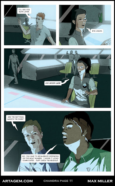
Though it's not particularly apparent on this page, it should be understood by now that Tom is a jerk with some kind of chip on his shoulder, and Rocky is that rare combination of a free-spirit, yet duty-oriented dude. One of the real challenges I've found when making a graphic novel is giving characters a unique voice (not saying that I'm particularly successful here). Sometimes I read comics where everyone sounds exactly the same, there's no texture, thoughts or opinions peculiar to individuals. It's a really subtle thing and I think that writers like Brian K. Vaughn do a really good job with this. Though, his reliance on making everyone a trivia hound about everything can get a bit distracting.
It's funny looking back at these pages and realizing just what a big job this thing (Chandra) was and how unprepared I was for it. Not only do have to be able to competently draw and write to make a graphic novel, you have to be an art director, an architect, an interior designer, a topographer, a scientist, a linguist...the list goes on. Of course you can fake a lot of these. If you're skilled enough in the art department you can make anything convincing with just a few strokes of the ol' pen.
Monday, August 8, 2011
1000 Things To Learn, #1: (Try To) Draw Every Day
You know how they tell kids who want to play basketball for a living to take a basketball with them everywhere? They should be sleeping with that basketball. You have to get a feel for it in your hands, the space it occupies next to you, how it moves when you dribble it. It's the same with drawing. I take a sketchbook with me where ever I go. In fact, I'm a junkie for sketchbooks. I have moleskin's tucked into the glovebox in my car. Sketchbook on the coffee table, another by my computer. One there under my bed. I'm drowning in the damn things. They might not ever get all filled up but the important thing is that when I have an idea it's written down or even better, drawn.
You have to draw every day. You're waiting in the doctor's office? Don't pull out your phone. That's a time sink. Get that sketch book out and draw the fake ficus in the corner. Draw from life as much as possible. And then draw from your imagination twice as much. Dry to envision something random and draw it, exactly as it appears in your mind.
When I was studying painting in Italy our first task was the old cast drawing gag. We weren't supposed to touch a paint brush until we'd been drawing plaster replicas of classical sculpture in charcoal for at least one year. That's four hours a day, every week day, working on a single drawing for at least a week, sometimes as much as three. Those unfamiliar with drawing from busts and other plaster models don't know what they're missing. It's tedious but it teaches your eye to really see. It sharpens your edge so you're attuned to proportion like nothing else.
BUT, the point is not cast drawing. That's a worthy exercise, but it only gets you so far. We're talking about the sketchbook here. Whip that thing out and spin your ideas, copy from magazines, get friends to sit for you, draw that sleeping dog over there. Become sensitive to line and mass. Those two elements are the groundwork for anything you'd build on the page. Those are the visual components, but they are informed by your honed understanding of proportion, perspective, volume and light.
Anyway, this all brings us to what I'm calling THE CURRICULUM. I've set myself a series of twelve areas of study to become an effective creator of Graphic Novels, webcomics, what have you, and they are these:
1] Scripting
2] Art Direction
3] Visualization
4] Anatomy
5] Character Design
6] Cartooning
7] Drawing
8] Interiors/Objects
9] Inking
10] Ink Wash
11] Watercolor
12] Digital Coloring
Now, each of these categories contains subgroups that I won't go into now as I have more in-depth write-ups planned for each, but these are the major building blocks I've identified that are important to master when creating a graphic novel. I feel I'm experienced in a number of these, while others are severely lacking at the moment. BUT, from this list, I'm setting tasks for myself which I will detail here. Those aspiring creators out there are welcome to join me and also, suggest things I may have left off the list.
Before I go, I'm highly, highly recommending a book for anyone who calls themselves an artist. It's Harold Speed's Practice and Science of Drawing, and it is phenomenal. Though it was written in the late 19th or early 20th century it contains none of that stuffy, antiquated language. It's remarkably fresh and easy to digest and even if you don't draw, it will make you want to.
 |
| Michelangelo's Sensitive Line and Expert Rendering |
You have to draw every day. You're waiting in the doctor's office? Don't pull out your phone. That's a time sink. Get that sketch book out and draw the fake ficus in the corner. Draw from life as much as possible. And then draw from your imagination twice as much. Dry to envision something random and draw it, exactly as it appears in your mind.
When I was studying painting in Italy our first task was the old cast drawing gag. We weren't supposed to touch a paint brush until we'd been drawing plaster replicas of classical sculpture in charcoal for at least one year. That's four hours a day, every week day, working on a single drawing for at least a week, sometimes as much as three. Those unfamiliar with drawing from busts and other plaster models don't know what they're missing. It's tedious but it teaches your eye to really see. It sharpens your edge so you're attuned to proportion like nothing else.
BUT, the point is not cast drawing. That's a worthy exercise, but it only gets you so far. We're talking about the sketchbook here. Whip that thing out and spin your ideas, copy from magazines, get friends to sit for you, draw that sleeping dog over there. Become sensitive to line and mass. Those two elements are the groundwork for anything you'd build on the page. Those are the visual components, but they are informed by your honed understanding of proportion, perspective, volume and light.
Anyway, this all brings us to what I'm calling THE CURRICULUM. I've set myself a series of twelve areas of study to become an effective creator of Graphic Novels, webcomics, what have you, and they are these:
1] Scripting
2] Art Direction
3] Visualization
4] Anatomy
5] Character Design
6] Cartooning
7] Drawing
8] Interiors/Objects
9] Inking
10] Ink Wash
11] Watercolor
12] Digital Coloring
Now, each of these categories contains subgroups that I won't go into now as I have more in-depth write-ups planned for each, but these are the major building blocks I've identified that are important to master when creating a graphic novel. I feel I'm experienced in a number of these, while others are severely lacking at the moment. BUT, from this list, I'm setting tasks for myself which I will detail here. Those aspiring creators out there are welcome to join me and also, suggest things I may have left off the list.
Before I go, I'm highly, highly recommending a book for anyone who calls themselves an artist. It's Harold Speed's Practice and Science of Drawing, and it is phenomenal. Though it was written in the late 19th or early 20th century it contains none of that stuffy, antiquated language. It's remarkably fresh and easy to digest and even if you don't draw, it will make you want to.
Sunday, August 7, 2011
Stray Flights # 1: Desiccate, Page 3
Begin 'Desiccate' / Go to Previous Page / Go to Next Page

Whew! He made it. Our wanderer isn't going to die of dehydration. I had a real issue with figures in this comic. I'm not sure what the problem was but I was trying out something new with shadows, spreading them around a little more. I'm intrigued by this idea of 'spotting blacks.' Using bursts of black in shadow to create an avenue for the eye around the page. It something I'm definitely trying to explore more and I'd like to make an entire graphic novel with thick, pervading blackness throughout. I've got a horror story idea, maybe I'll get to it in like three years.
Something else I found tedious was drawing all the bits and baubles of the gas station. BUT, I've since become more comfortable drawing surroundings and atmospheric accessories. They're really what create the PLACE for your characters to inhabit so it's just as important. Still, I'm impressed when an artist can go a few pages with just white backgrounds, using only the characters to tell the story. Jeff Smith does this all the time in BONE. It's something I think that it's easier to get away with in a black and white comic.
You can visit the Brainstormer HERE, that's where the inspiration for this Stray Flight came from.
Side note: Scotty there was based on Steve Buscemi as a reference. For some reason he just seemed to fit.
Friday, August 5, 2011
Stray Flights # 1: Desiccate, Page 2
Begin 'Desiccate' / Go to Previous Page / Go to Next Page
 Friends, don't forget to check out Andrew Bosley's Brainstormer (the inspiration for this Stray Flight), he's got some sweet illustrations as well.
Originally I packed this Stray Flight full of word bubbles. This was obviously a mistake. One of the elements I was really trying to go for was the all-encompassing aspect of the desert, and the pervading nature of the sand, sand everywhere. This was cluttered up by too much dialogue and interior monologue coming from our wanderer there.
Also, on a whim, I changed the order of panels on this page. I drew them at first with the close-up reaction shot as panel three but right before I colored it I switched it down to the last panel, realizing it would make for a better composition. I guess we have it so easy now with digital means.
This is such a quandary. While I appreciate the ease with which things are accomplished when using a computer, it also can lead to a lack of accountability. This is why I'm such a fan of traditional media. I was trained as an oil painter after all. I can't tell you how many times I stood in front of an easel wishing I could press 'command-z.' BUT, the struggle to get something right, directly from your own hand, is irreplaceable, and it shows in your work as well. This is not to say beautiful digital work isn't made. There are plenty of effects that just can't really be replicated any other way. But I think it's akin to the use of CGI in film. This is something that by and large many, many people complain about as looking fake (depending on the skill level of the effects magicians, budget, etc). It's simply just overused. I have a great love for 80's films, not just for the nostalgia but often because the application of practical effects had reached a great point at that time before often being supplanted by CGI. Stand Winston! Look at that guy's ability. Pumpkinhead dammit! Have you seen it? A great costume. If Pumpkinhead had been CGI he wouldn't be nearly so memorable, or menacing. Anyway, because of all this I find myself leaning closer and closer to working in traditional media when I begin making my next graphic novel (perhaps ink, watercolor). It's ironic, but I just find that the immediacy of working with my hands so much more refreshing, and funnily enough, quicker.
Stray Flights # 1: Desiccate, Page 1
Begin 'Desiccate' / Go to Next Page

It's now time to start posting Stray Flights. Here is the first page of the first one, 'Desiccate.' 'Desiccate' is eight pages long and I did a little experimental process with this one to try to achieve something that looked like watercolor, but using a digital means. With Chandra I drew all the line work in pencil and then upped the contrast to make it look like ink. Here I just went straight in with ink to delineate the forms. It's still colored digitally though. After sectioning and coloring the large shapes I applied some watercolor textures over top to get something like a watercolor texture.
I envisioned this Stray Flight like some sort of little Twilight Zone episode. Let me know if it turned out successful or not. One fun thing about the Stray Flights is that it allows me to draw a range of subjects/objects I might not normally tackle, and to experiment with different styles.
This particular Stray Flight was inspired by some random words over at Andrew Bosley's Brainstormer. It's a great fun toy when you're feeling a bit stuck for an idea. The basic idea is that it's a lot of words that spin and output in differently combined ways. Check it out!
Thursday, August 4, 2011
Chandra, Page 10: What Do You Need The Shrink For?
Begin Chandra / Go to Previous Page / Continue to Next Page

Ok, so I busted out with the first ten pages here. At this point I'll be updating Chandra every TUESDAY and FRIDAY. If the update schedule ever changes it will say so in the right sidebar.
So, Dr. Bannister is at large? Where could he be? I'm trying my hardest here to create a good rapport between Jason and Marcella. It doesn't entirely work yet. The thing about Chandra is this: I'm still waffling on the opening of the book. I have two directions I could go. This one that you're reading, which is the slow build. Or I can take a few pages from later in the book, around page 40, and put them at the start and go with the modern "start with a bang and then work through flashback to get us up to speed." Is that what people prefer these days?
Chandra, Page 9: Sunspots Too
Begin Chandra / Go to Previous Page / Continue to Next Page

Yeah, it is a terrible joke. I think Jason is coming across as a bit of a creep in this scene. I swear he's a nice guy. One thing I found difficult about this project was how to go about injecting the life stories that I wrote for each character into what the reader sees about them. It's successful on different levels depending on the character. Some ended up coming across very flat, while others ended up feeling a bit richer. I'll leave it up to you guys to let me know what's working and what's not.
You know how when you watch a movie or read a book and you go "Oh stupid, why did they do that?" Well, here's your chance to help with the direction of THIS project. Crowd-sourced editing, that's what I want here. Your payment is the satisfaction that you've made a difference. That's worth more than gold.
Chandra, Page 8: The Company Man
Begin Chandra / Go to Previous Page / Continue to Next Page

I tried my hardest to establish the tenor of the characters as early as possible, you know, give everyone a distinct voice. It's something I've learned a lot about since I first wrote the script for this over a year ago. I actually ended up tweaking the dialogue a bit when it came time to populate the panels with bubbles. The problem is, when the drawing is done, it's done and there's only so far you can go off script before what you're writing doesn't make sense with the image.
In my next venture, my approach is going to be more of a single mind. The strength of a creator-owned property is that you have COMPLETE control over every aspect of the pipeline. This also means that everything rests on your shoulders though. With Chandra I took the approach of tackling each job (writing, drawing, coloring, lettering) as if each were an independent piece of the puzzle. With further experimentation after I finished Chandra I've learned that a better way to go about things is to conceive of the totality of the project from the beginning and interweave the different aspects of it as much as possible. In this way it's easier not to get caught up with the shifting gears of this kind of production. I guess this is all obvious but imagine this: you're walking through a forest and you turn a corner, suddenly there is a mountain in front of you, not miles away, but inches in front of your feet. At this point it would not at all be easy to know the best way to climb such a peak, you'd just have to start up it. But. At the top of that mountain you can see the descent AND more importantly, the next peak.
Chandra, Page 7: I have the touch
Begin Chandra / Go to Previous Page / Continue to Next Page

That's it, now you've been introduced to four of the nine person crew on Chandra. That guy there in the bottom left is sort of our focus in the story. I think that's what I was trying to subconsciously point to with the prominence in the foreground. He's a bit generic looking at the moment, but it's important to me that he have red hair. There aren't enough red-haired heroes out there.
You may have noticed this pervading texture all over the page. That was a last minute addition and I'm pretty pleased with the look. It ties everything together in a way that wasn't there before. It's simply a picture of concrete run through a few filters in Photochop and applied in a transparent overlay. I found that before the texture everything had too much of a flat feeling to it.
Now that I think about it, this book has a really weird look to it. It wasn't something planned, it just kind of naturally grew out of the process I was using when working on it. I made a lot of random decisions based on necessity in the moment. Mid-way through, when I began to color things I started pushing it in a sort-of cartoon direction, thinking that the panels were beginning to look like stills from some unproduced sci-fi animation.
Chandra, Page 6: Pisser.
The Beginning of Chandra / Go to the Previous Page / Continue to the Next Page

Now we're getting somewhere. Welcome to the interior of the Chandra base. Tom there is meant to be British, but I'm not exactly sure how well he's written and how much of that comes across. I know that less is more when trying to write accents. Two Britishisms in a row out of his mouth might be a bit much.
As you can see, the interior of Chandra is decrepit but, I feel I didn't quite get the level of degradation that I want, simply because there's not enough detail worked into the surroundings. If there's one thing I'm happy with about this panel, and pretty much all the scenes that take place inside the communication room, it's the lighting. I do feel that I nailed the look that I was going for in that respect at least. The glow is a pretty effective tool I found.
Wednesday, August 3, 2011
Hey, It's Time To Talk About: Blacksad
That which you absorb with your eyes and ears is just as important as that which is spun from the fingers. Therefore, take a moment to pause for a little review:
Blacksad by Juan Díaz Canales and Juanjo Guarnido

Let me begin by saying that Blacksad is a fantastic romp that had very few drawbacks. I'll start with the art. As you can see by the picture above, it's good, it's accomplished, and most importantly it was done in watercolor, appearing to be completely created in the real world. I'm a huge fan of traditional media and Blacksad spoke to me instantly because of this. The character designs are inventive, the expressions are spot on and the whole endeavor is just an absolute pleasure to look at. And that's no surprise as the illustrator, Guarnido has worked for Disney (Tarzan), and it shows. I love the fact that the book (which is a hardcover collection of three stories) feels like some kind of newly found Disney cartoon for adults. I can't express what a huge fan I am of the visual aspect of this book. As you can tell, I even went so far as to completely lift the boxy bubbles with the loopy tails for my own word balloons in Chandra.

This brings me to the only really glaring problem. While the stories are good, and a lot of the exposition can be gleaned from the visuals, there's definitely a feeling that something is lacking in the translation of the actual words in the book. This is not a knock on writer Canales at all. The fact that it's two Spaniards making it for the French market and then it was subsequently released in America may have something to do with it. I'm sure there were fine people working on the translation but for me it simple did NOT read well in that I felt integral pieces of each of the stories were being left out all along the way. A shame too because I want the writing to have all the verve of the art. All that being said, I definitely still recommend this book for anyone's shelf. I think it's popularity speaks for itself as it's sold well over 200,000 copies.
Grade: 90/100
Chandra, Page 5: Stand By For Transmission
The Beginning of Chandra / Go to the Previous Page / Continue to the Next Page

And here we are, continuing with the three bar format, on our zoom into Shackleton Crater in the southern hemisphere of the moon. It's funny, I feel like writing these things is like making a director's commentary.
Another area of struggle has been the correct font and bubble shape. There are just SO MANY options/directions one can go with this. It's like background music in a film, if it's good, you don't notice it. If it's bad, it's the first thing to stab you in the eye (or ear, as it were).
Here you can see I was playing around with a bubble colored a slight yellow to indicate another voice. Not sure how that reads though.
For Chandra I ended up going with the Digital Strip font at Blambot.com, a really excellent resource for hopeful creatives.
So...who's talking here? You'll find out on the next page.
Chandra, Page 4: To The Moon!
The Beginning of Chandra / Go to the Previous Page / Continue to the Next Page

At this point it was about a year ago that I drew this thing. I remember really struggling with how much detail to put into the moon's surface and I ended up splitting the difference with some textures. I now know: the more detail the better! You have to understand, for some reason I really really really hurried through this project. I don't know what it was, I think I wanted to feel like I had something, anything under my belt. Unfortunately for Chanda, she was the sacrificial lamb.
At the time that I drew this my thoughts were that I should just get through it and the story would be strong enough to carry the artwork if it wasn't exactly up to snuff. Lesson learned: Make EVERYTHING as strong as possible. Put as much work into prep as into execution. Better to take four years to make one project than one year to make four projects.
Chandra, Page 3: WOW!
The Beginning of Chandra / Go to the Previous Page / Continue to the Next Page

Hey, he's really excited. I would be too, it's too bad we don't go back to the moon. Like all kids, when I was six, I thought we'd be living on the moon by the time I reached the age of 30. Flying cars too. Well, I guess we have cellphones and computers instead, baby steps, baby steps.
But, imagine for a moment that colonies had been established on the moon. The moon would be the next great Wild West, everyone out for themselves. All those people that have bought real estate on the moon would be fighting over their scrappy plots of moon dust.
It's a simple composition, meant to bring us into the story and the next page...
Chandra, Page 2: It Looks Like A Rabbit
The Beginning of Chandra / Go to the Previous Page / Continue to the Next Page
 It's true, I can't NOT see a rabbit when I look at the moon. It's always been that way.
I have to say that these first five pages came out a little more purple than I would have liked. I sort of envisioned them as a bit more tangerine when I was conceiving this. The thing is, an artist's effectiveness is dictated by his ability with the tools he chooses. So, when hindered by the challenges of a new material/medium one can find it difficult to get right at that idea that's hovering in their mind. You can see it, but it's a matter of getting your hands to do the mind's bidding. It's tough, and frustrating and it leaves a lot of people weeping in the corner, including me.
By the by, who are this guy and this kid? They don't have names, hmmm...
Chandra, Page 1: Double The Worm Over
The Beginning of Chandra / Go to the Previous Page / Continue to the Next Page

Finally page one! So here it is, the very first comic book page I've ever drawn that I didn't copy from somewhere else back when I was thirteen years old. Actually that's totally a lie. I did make a graphic novel with a friend when I was twelve (hardbound and everything, though only one copy existed). It was called Lancelot and it had nothing to do with the handsome knight. It was about a group of mutants hunting down some material called Hydrosilverton, yeah. Anyway, total X-Men rip off, illustrated in pencil and filled in with colored pencil.
Anyway Chandra. This page has gone through so many changes and really here's the earliest example of me trying to figure out how to digitally color things. Can't say I'm entirely proud of the result but it's...something.
Onward!
Chandra, Page 0: The Moon Quote
The Beginning of Chandra / Go to the Previous Page / Continue to the Next Page

Why am I bothering with a weird quote? Because that's what everyone does right? It lends literary credibility to the work before you even get to the meat right? Well, yes and no. Really I just felt that this thing by Lawrence just summed things up nicely, but perhaps it's pretentious. What do you think?

Chandra, Note: Apology
The Beginning of Chandra / Go to the Previous Page / Continue to the Next Page

I figured that if anyone runs across the ISSUU version of Chandra they may be wondering what it is. This page serves as simply a small description and note about the project. Really, I want to cover my butt and show everyone that this thing is just a work-in-progress, my sandbox where I learned a lot about what works and a whole lot more about what doesn't work when attempting to make a Graphic Novel.
I know: There's stiffness in the figures, there's a certain simplicity to the faces and lack of emotion sometimes. There's a lack of detail in the surroundings. Some of the coloring and shadows are a bit funky. The dialogue needs to be beat with a lead-lined edition of Strunk and White. What else? Despite all this, I still like the work and that's why it's being posted.
Subscribe to:
Posts (Atom)